
Better Patient Outcomes with Epic Language Access Integration
Learn how to improve health outcomes and ensure compliance for individuals with Limited English Proficiency (LEP) with direct language access integration to the Epic Electronic Health Record (EHR) system.


Case Study: Multilingual Retail Marketing
New AI Content Creation Solutions for a Sports and Apparel Giant

Human Expertise Blended With Powerful AI
Lionbridge Aurora AI™ is an AI-first global content platform that increases your multilingual content creation and expands your audience with culturally relevant, hyper-personalized content.
- RESOURCES


Why do global marketers go to such great lengths to create user-friendly, high-quality websites?
There’s a wide range of reasons that all add up to one greater goal—to create an exceptional user experience (UX) that helps convert more prospects into customers for more sales and profitability.
How? Through effortless navigation, useful functionality, and intelligent multilingual website design that enables localization by a professional website translation company.
Be consistent to boost your brand and amplify global messaging
Consistency is key when developing and managing multilingual websites to ensure that all visitors enjoy the same smooth, intuitive UX—regardless of language or locale. Because across most markets, you’ll want to promote the same brand, convey the same messaging, evoke the same emotions—and provoke the same actions.
Through planning, cross-functional expertise, and intelligent multilingual website design, you can provide the experience your customers deserve with a consistent look and feel across all of your global sites.
Stand out from the global crowd with intelligent multilingual website design
How will you stand out from the crowd and provide an exceptional global UX? Here are 9 essential elements that are common to all intelligent multilingual website designs.
Use global templates for consistent brand expression across all sites
Though you can offer some direction, you can’t control which site an international visitor will access. German users may be visiting your U.K. site. Maybe a Dutch user unintentionally lands on your French site.
You already know that you should maintain a consistent global brand image—so it’s clear that each website is a regional representation of your master brand. But it’s also suggested that sites be customizable to meet the needs and fit the tastes of local audiences.
To do this, you should use a global template for your multilingual sites whenever possible. Most of the world’s leading multilingual sites employ global design and layout templates which may be optimized for desktops and mobile devices. They increase efficiencies, manage text expansion, and help your localization team maintain control over visual presentation, including user interface (UI) and branding elements.
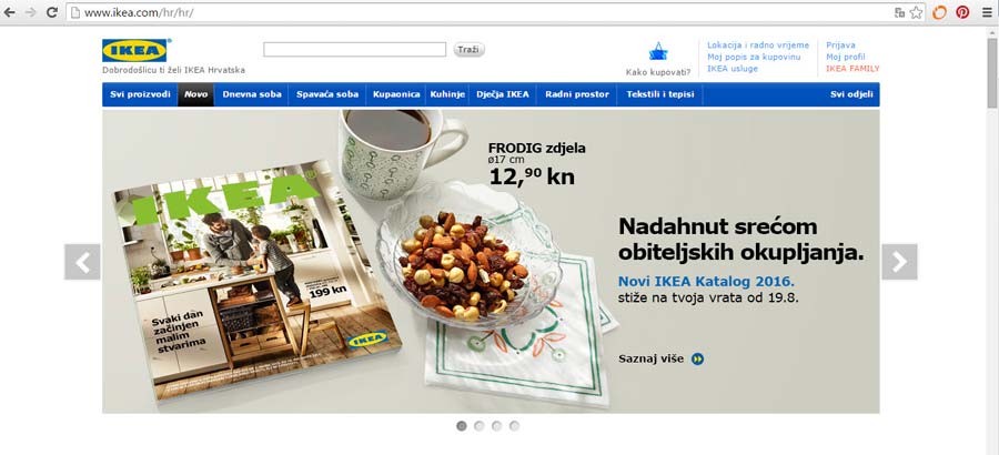
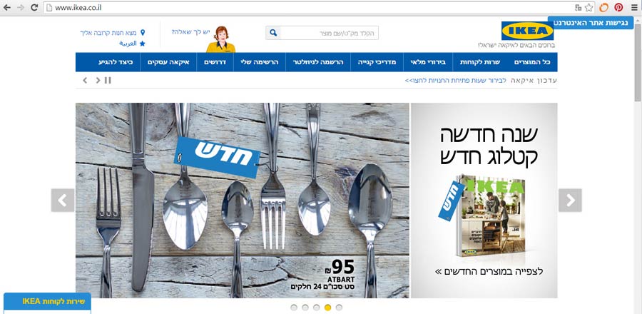
One strong example of global template usage can be seen on IKEA’s website. Note in the screenshots below how both language sites have a clean, simple layout without much color. The horizontal spaces allow for customization, but the IKEA brand is maintained across both sites—they are both recognizably “IKEA.”
Global templates enable regional teams to run unique campaigns and content to meet locale-specific needs and preferences. They also simplify multisite management while reducing design and development expenses. And you save on costs associated with coding errors, quality control, and maintenance.
A flexible template can accommodate all languages including Western (left-to-right reading), East Asian or multi-byte, and what the industry calls bidirectional or right-to-left reading languages. These comprise Hebrew, Arabic, and languages that use the Arabic script—such as Farsi, Pashto, and Urdu. For bidirectional languages, templates are created with a right-to-left orientation.
Design global gateways with the user in mind
As you create your global templates, pay special attention to designing your global gateway. A global gateway is a navigational system that directs users to specific localized versions of a website. They’re often found at either the bottom or the top of multilingual websites.
The design and placement of the global gateway is important too. If it’s difficult to find—or is only viewable in a source language that your user doesn’t understand—they might give up and search elsewhere for information. The process of searching for and finding a global gateway should be effortless and intuitive in any language.
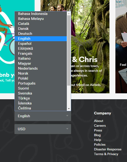
There are a few common designs used for global gateways. Perhaps the most common is the drop-down box—where the user selects their language from a scrolling list. Airbnb uses this design on their global site.
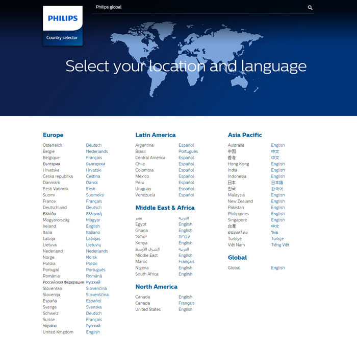
Or you can use a dedicated landing page that directs the user to their native language site, like the Philips website.
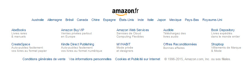
And it’s also possible to list languages directly on webpages, like Amazon does at the bottom of their site.
A common faux-pas in global gateway design is to use flags to represent languages. What about countries with multiple languages? Or countries that share a language? Unless you’re representing a specific country (for example, a website that sells certain products in certain countries), steer clear of flag use.
Instead, try to represent locales. Sometimes the best way to do this is to simply write the name of the language. In this arrangement, it’s important that languages names are written in their own language, so instead of including “English, French, Italian” in the list, it should read “English, Français, Italiano.”
You can also specify different language flavors for each country (i.e., Switzerland-French, Switzerland-German, Switzerland-Italian).
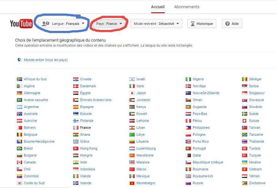
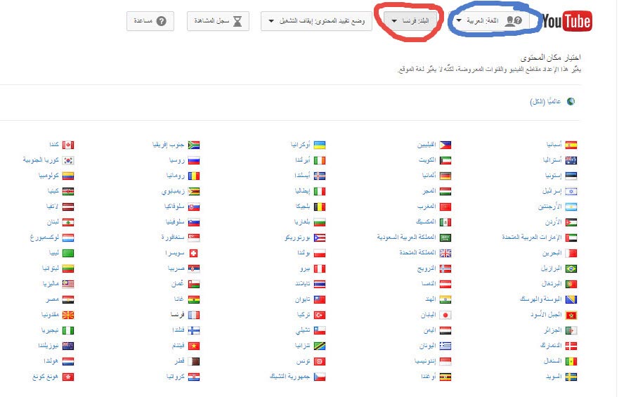
YouTube has a fairly complex global gateway set up, since it caters to both language and location separately. In the images below, the country selections are circled in red, while the language selections are circled in blue.
Build sites to accommodate a range of global internet speeds
Before a user can look at anything on a website, it must first load. You don’t want to keep your user waiting while a graphic- or text-heavy page loads.
Internet speeds around the world vary—greatly. In their report, State of the Internet 2015, Akamai Technologies, collected sample connection speeds in Mbps (megabits per second—a measure of data transfer speed) from IP addresses around the world.
It’s clear how much internet speed variance exists. A site designed for the internet in Ireland would crawl—painfully slowly—in Venezuela.
Be sure to match your site to the internet speed of your target locales by removing, optimizing, or modifying graphics and other large files that could slow download times for international users.
Internationalize to ensure exceptional purchasing and shipping experiences
When it comes to translating ecommerce websites, there are some additional steps to be aware of. Once you understand local laws around online purchases and shipments, you’ll have to adjust your website for different currencies and shipping address formats. These functionalities should be addressed early in the web development process as you internationalize your site to accommodate these and other variables. Your ecommerce provider may also help with this process.
Take the European Union, for instance. While most countries use the Euro, several do not. The Czech Republic uses the koruna, Poland uses the zloty, and Hungary uses the forint.
When site visitors see prices in their own currency, they are far more likely to buy. Having done so, they’ll then provide their shipping information. Given that not all address formats are the same, you will also have had to address this additional set of variables.
Across global markets there are several different conventions for indicating street numbers and names, postal codes, and telephone numbers, etc.
These may seem like minor details, but remember—multilingual website design is all about creating an effortless, exceptional UX. So it’s best to anticipate and address these issues early in the site development process to avoid confusing or frustrating site visitors—and potentially losing sales. Paying close attention to form functionality and other ecommerce functionalities on your multilingual websites can prevent these types of “huh?” moments.
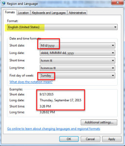
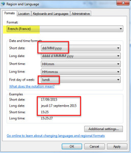
Format time and date conventions to support global variations
And when it comes to time and dates, be aware of local formats. English speaking countries like the U.S., the U.K., and other former U.K. colonies often use a 12-hour clock, but the majority of European countries—and many other countries around the world—use a 24-hour clock.
Calendar date formats can vary too. In the U.S., for example, a month/day/year order is used, and Sunday is often considered the start of the calendar week. But in France, a day/month/year order is used, and Monday is often considered the start of the calendar week.
Use images, icons, and other elements that are culturally appropriate and contextually relevant
Art, by its very nature, is subjective. So are commercial graphics, photographs, icons, and symbols—especially after website translation.
Designs that seem innocent or stylish to Westerners may be offensive in other cultures. Avoid images of hands, animals, or religious symbols. Use culturally appropriate people in photos. And play it safe. Do your research and check with in-country staff if you have any reservations.
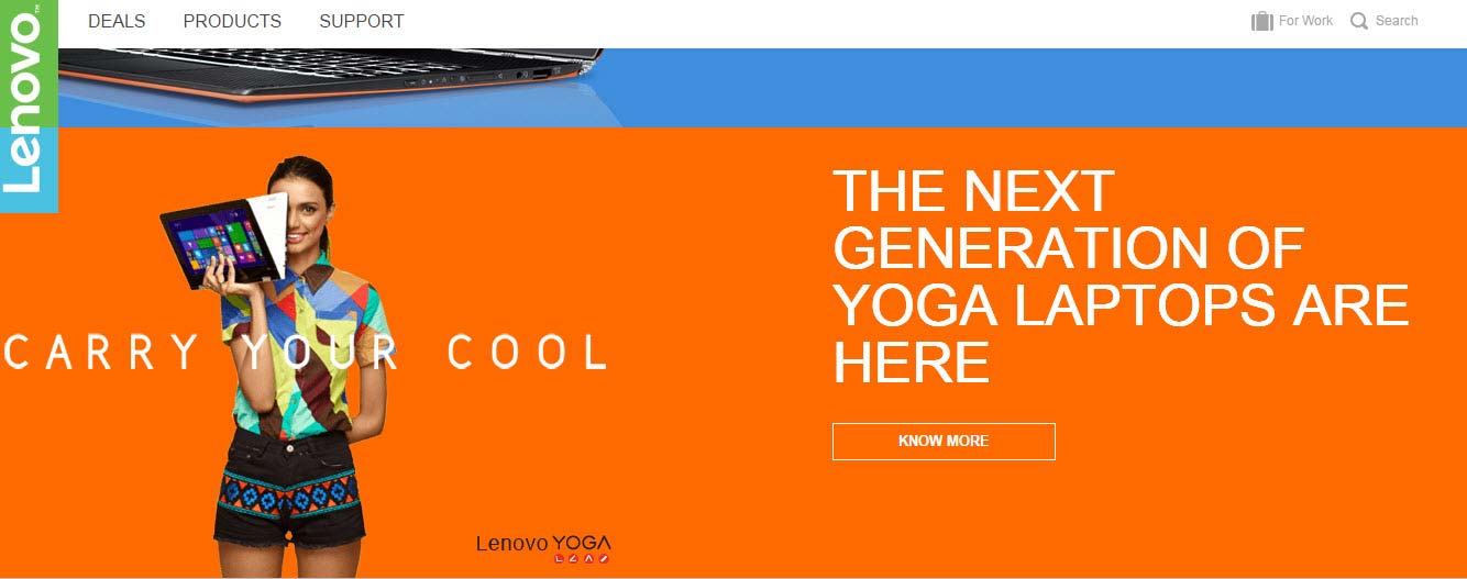
Lenovo’s website localized for India.
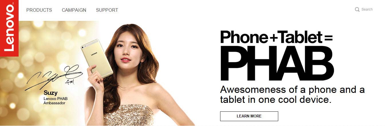
Lenovo’s website localized for Singapore.

Lenovo’s website localized for the U.S.
For example, a globe icon is often used to represent something international. But even images of globes can have a shade of bias. In the image below, you can see how each globe favors a particular region. So which globe icon should you choose?
![]()
A simple answer could be to use the one in the top right corner, where no regions are favored. But again, even small details like these can make a big difference in your multilingual site visitor’s experience.
Research the cultural connotations of colors—and choose accordingly
The interpreted symbolism of colors varies widely from culture to culture. Some experts claim that the most globally accepted color is blue. Perhaps because of its connections with nature, it tends to evoke positive feelings and a sense of calm. In Iran, however, it’s associated with mourning.
Since colors are so subjective, it’s suggested to use them functionally on your website and to research conflicts if you’re not sure of cultural implications.
Create localization-ready graphics that avoid embedded text
When using graphics, avoid embedding text in the design files. It complicates the process by preventing easy access to text for translation and may entail the otherwise avoidable task of rebuilding graphic files.
Instead, suggest that your web developers overlay text onto graphics within the HTML (if doing so provides the quality and control you need).
The image below would be a poor graphic choice for a multilingual website. The captions are embedded in the image in English, and there’s even an English word—dictionary—embedded in the laptop icon.
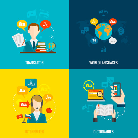
Save more time and cost by asking your graphic designers to create separate text layers in their Adobe Photoshop or Illustrator source files. You’ll also benefit from an important SEO best practice since search-engine web crawlers can’t read text that’s embedded in images.
Tip: Adobe PDF files can make it difficult to access content for translation. PDFs can’t be edited in some programs and can lose formatting when converted into translatable formats—which can result in lost content, edits, costs, and delays. So when working with your LSP, it’s best to provide original design source files to ensure the best-quality translations.
Create flexible UIs and have them reviewed by a desktop publishing specialist
When translated from English, some other Western languages can expand by up to 35% or more. So planning is critical, especially when localizing web app interfaces, site navigation menus, and other elements such as call-to-action buttons, etc.
It’s a localization best practice to have a multilingual desktop publishing localization expert review and/or edit your UI to avoid text expansion and related issues. Here’s a simple example of how text can expand:


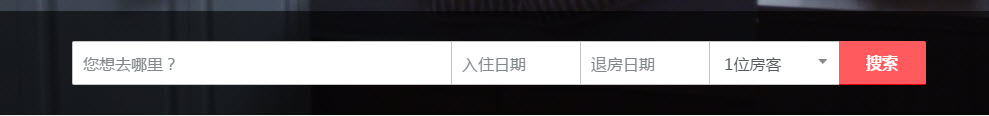
As noted above, you can prevent this by building a flexible UI, like this example from Airbnb. Note that the search forms and buttons stretch or shrink according to the length of the text.
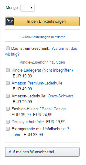
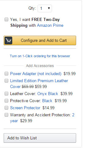
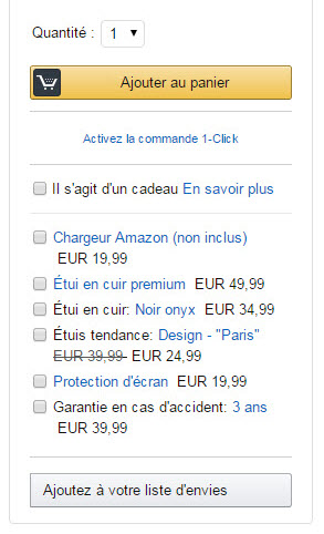
Or, you can design a UI with space that accounts for expansion. Take this example from Amazon—the “add to cart” button has been created with lots of extra space around the text. Even if text expands, it still fits into the yellow box, as shown below.
And more…
This list highlights the essential elements of multilingual website design—but it is by no means exhaustive. To catch all the small details that contribute to an effortless, exceptional UX, it’s best to work with a language service provider that understands the cultural and linguistic nuances of your target markets.